
The Project
A re-branding and package design suite for a local kombucha brewer – with an emphasis on appealing to their wide audience of health conscious consumers to Deadhead hippies.

The Challenge
Creating a look for yogi moms to jam-band lovers is a trick in itself. We also have to think about how to stand out from others in the display case. So instead of leaning on super immersive designs, we decided to go clean + clear with fewer elements applied in impactful ways.

The Big Idea
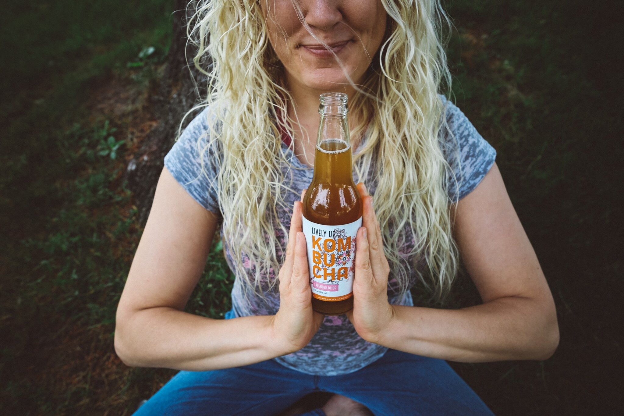
Lively Up is a local company in Muskegon, Michigan that craft brews all its kombucha with care, spirit and pride. The product is pure and clean while the tone of the brand is down to earth, raw, organic and vegan.


The Process
The main brand encompasses the circle of life symbol, floral, and sunshine elements to hit on all tiers of drinking kombucha and living a spiritual vibe. Combining that with a handmade font hints back to the craftsmanship of the product. For the package, we utilize bold typography, bright color pairs and clean iconography in order to create a brand that captures a fresh, fun and friendly experience.


Credits + Roles
Megan Jackson – Graphic Design, Branding, Package Design, Art Direction
Jenn Marie – Photography